


Mulah Case Study
Mulah Case Study
Mulah Case Study
Role:
UX/UI Designer
Role:
UX/UI Designer
Role:
UX/UI Designer
Project Scale:
7-month solo project
Project Scale:
7-month solo project
Project Scale:
7-month solo project
Primary Stakeholder:
CareerFoundry UX course
Primary Stakeholder:
CareerFoundry UX course
Primary Stakeholder:
CareerFoundry UX course
Tools Used:
Figma | PowerPoint
Tools Used:
Figma | PowerPoint
Tools Used:
Figma | PowerPoint
The Problem
The Problem
?
?
How might we make managing personal finances easier and more accessible for people at any stage of their financial journey?
How might we make managing personal finances easier and more accessible for people at any stage of their financial journey?
How might we make managing personal finances easier and more accessible for people at any stage of their financial journey?
Managing personal finances is overwhelming—especially when tools are scattered.
Managing personal finances is overwhelming—especially when tools are scattered.
Managing personal finances is overwhelming—especially when tools are scattered.
The Solution
The Solution
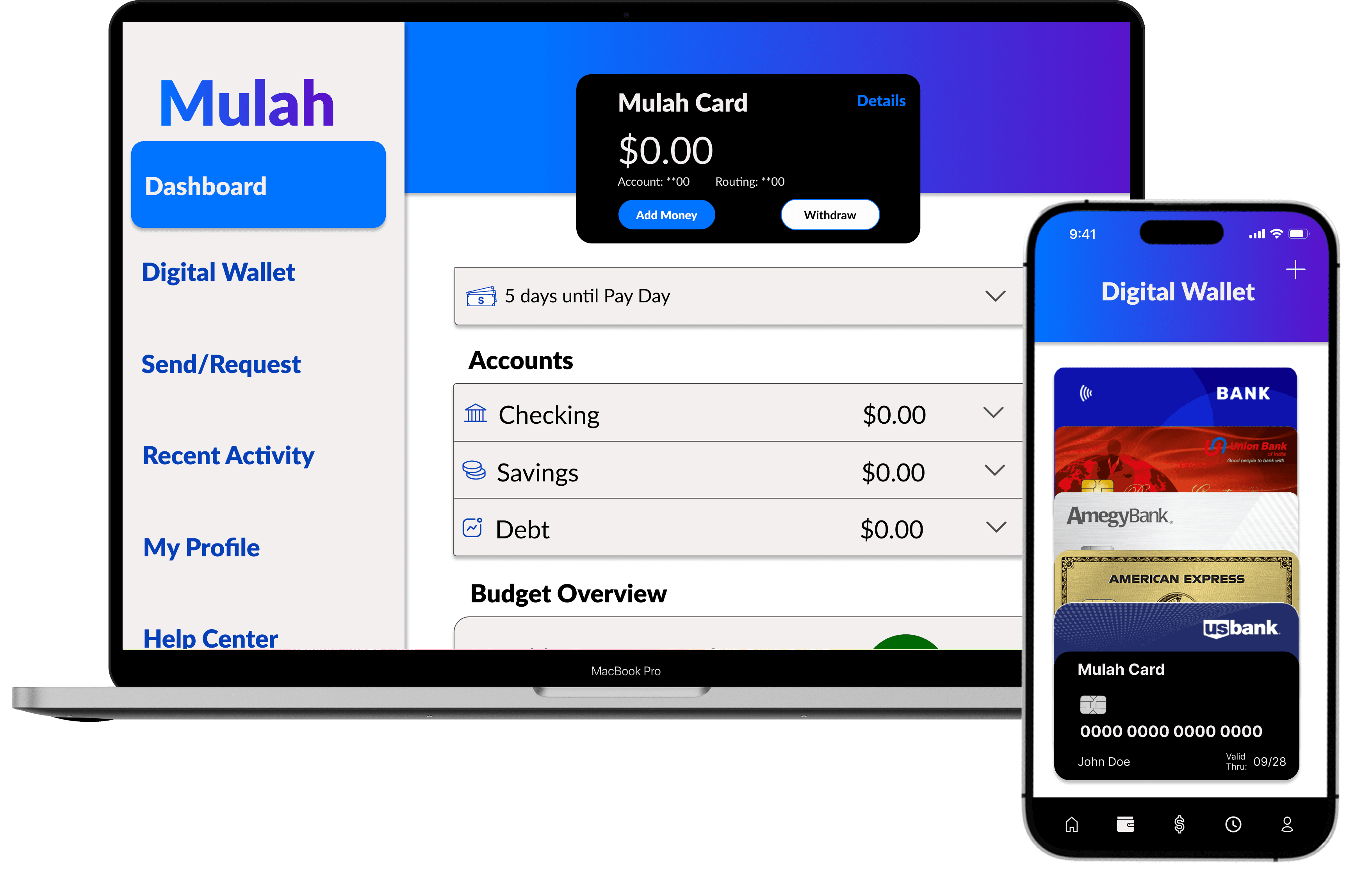
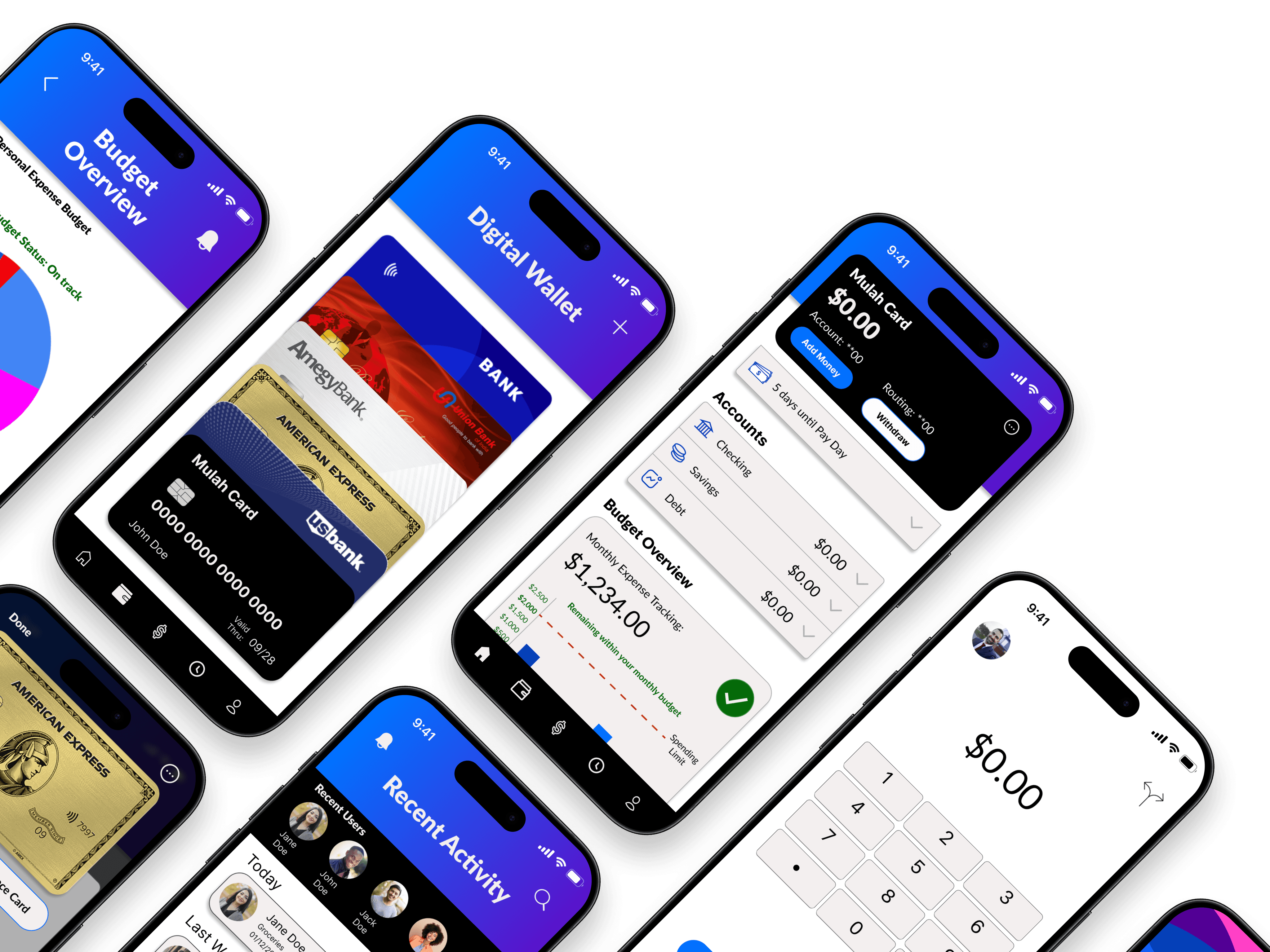
One Platform.
Every Financial Move.
One Platform.
Every Financial Move.
One Platform.
Every Financial Move.
Create a responsive web app that makes personal finance feel approachable and actionable—providing an intuitive and engaging experience.
Create a responsive web app that makes personal finance feel approachable and actionable—providing an intuitive and engaging experience.
Create a responsive web app that makes personal finance feel approachable and actionable—providing an intuitive and engaging experience.
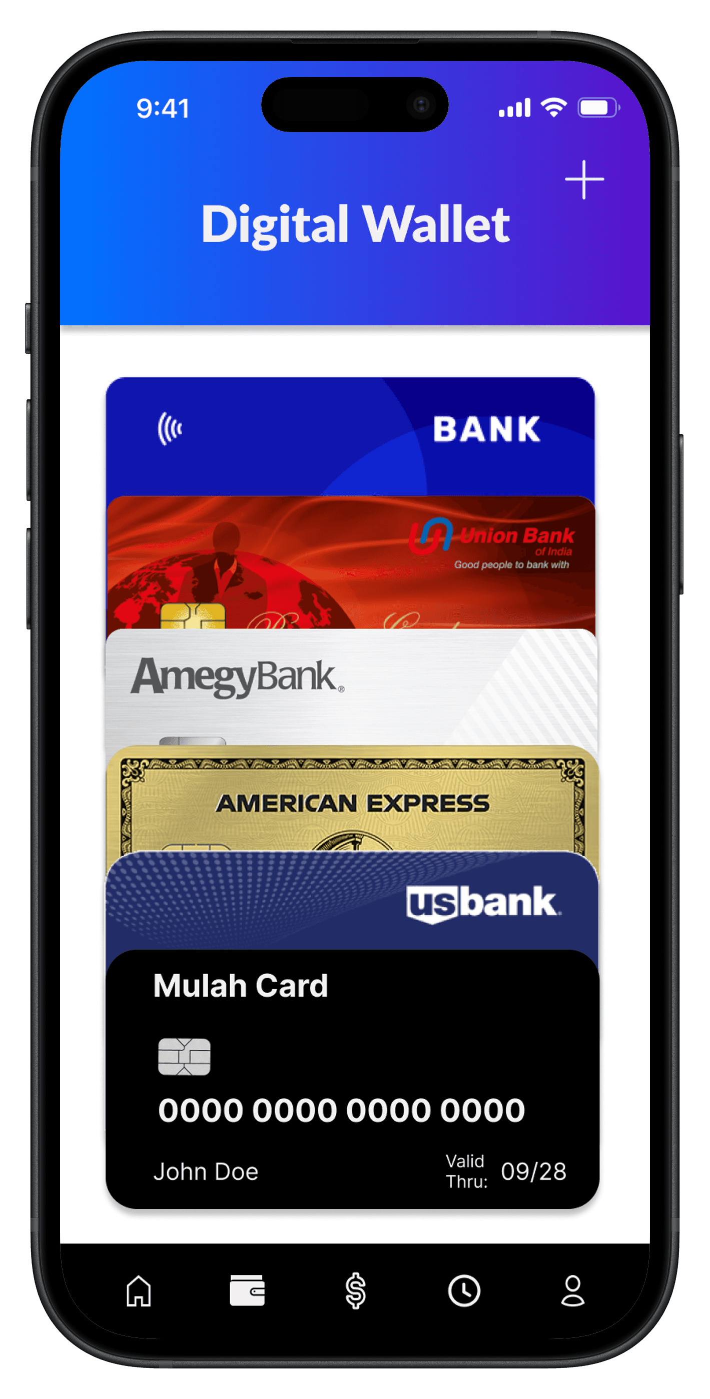
Consolidation is Key.
Consolidation is Key.
Consolidation is Key.

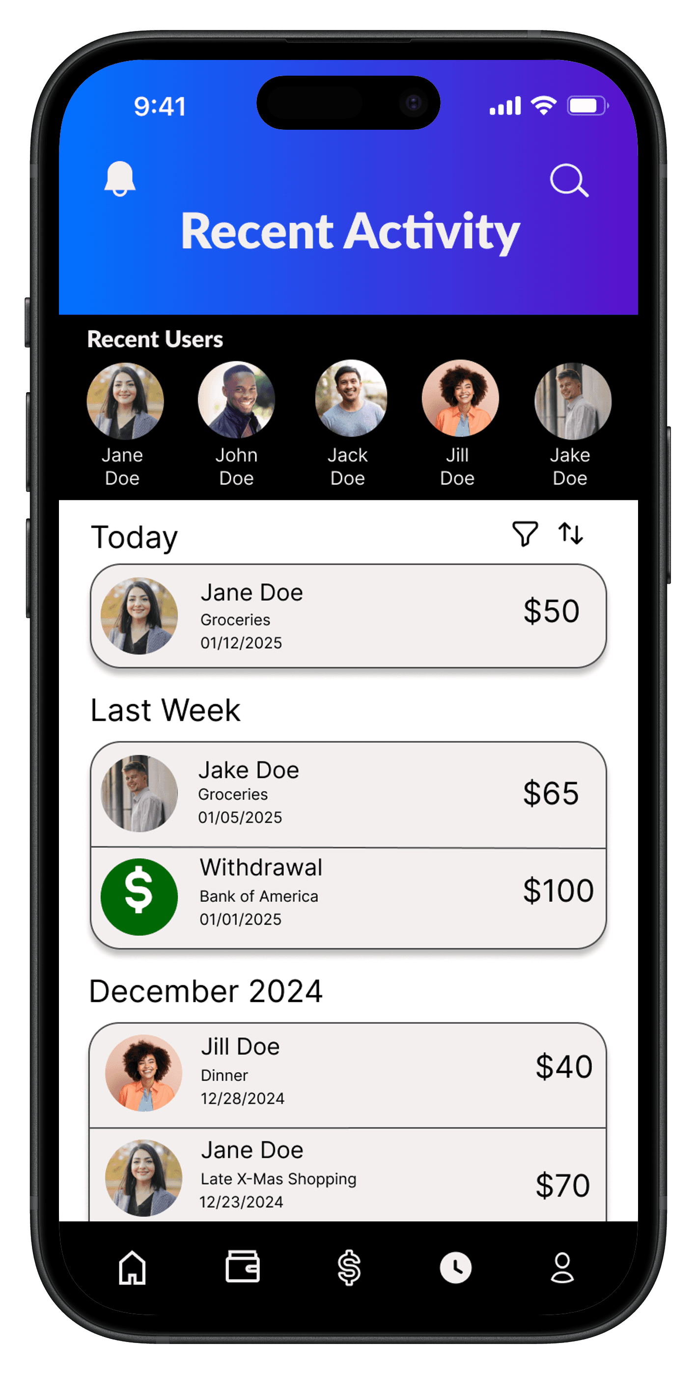
Simplicity Powers Control.
Simplicity Powers Control.
Simplicity Powers Control.
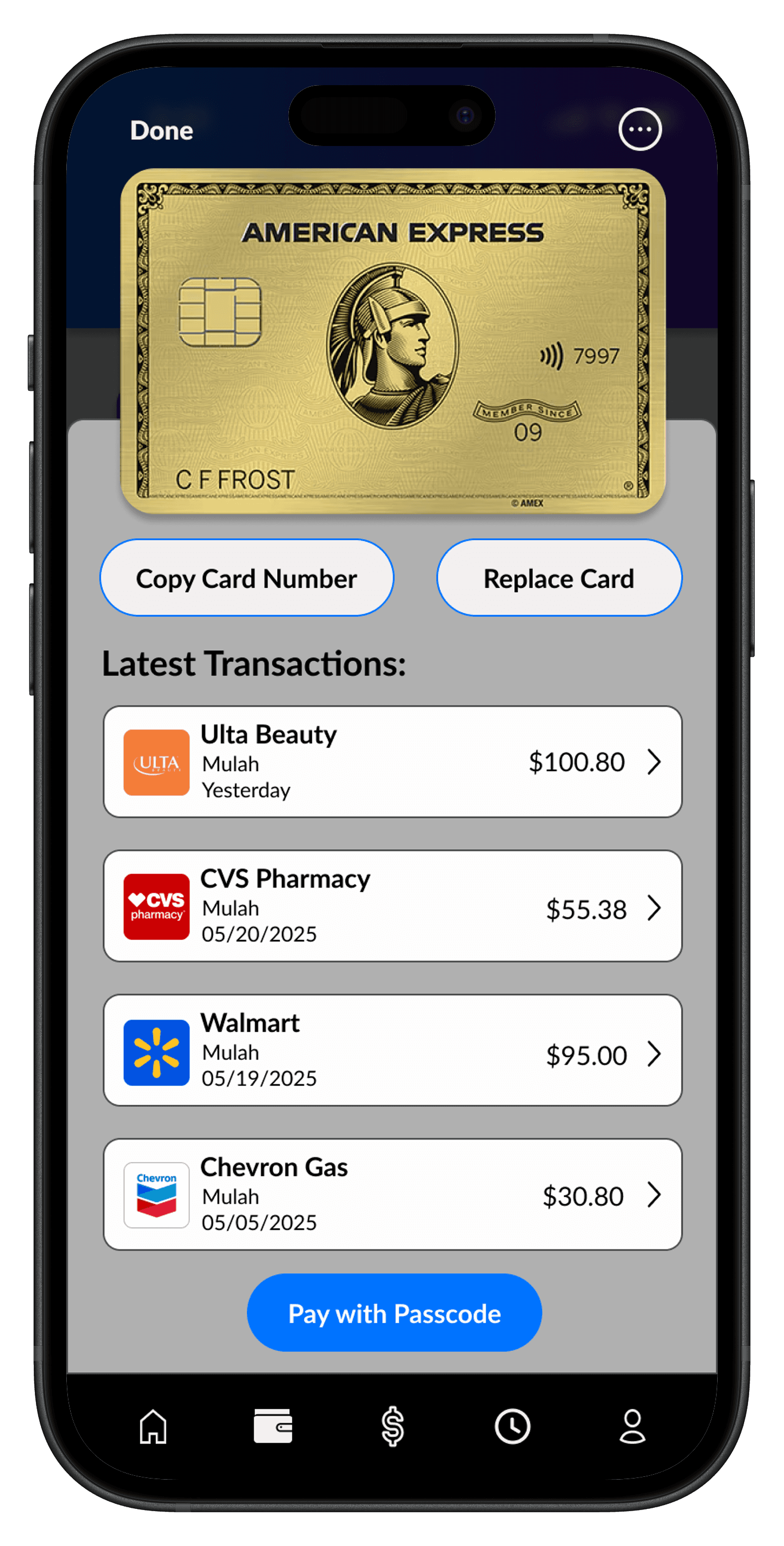
Understanding Builds Confidence.
Understanding Builds Confidence.
Understanding Builds Confidence.


Competitive Analysis
Competitive Analysis
The competition lacks consolidating aspects.
The competition lacks consolidating aspects.
The competition lacks consolidating aspects.
I kick started my research with a competitive analysis of 4 popular apps that aimed to help users manage their finances. It quickly became clear that while each app addressed parts of financial management, none offered a truly all-in-one seamless experience. This discovery became the foundation for my proposed solution.
I kick started my research with a competitive analysis of 4 popular apps that aimed to help users manage their finances. It quickly became clear that while each app addressed parts of financial management, none offered a truly all-in-one seamless experience. This discovery became the foundation for my proposed solution.
I kick started my research with a competitive analysis of 4 popular apps that aimed to help users manage their finances. It quickly became clear that while each app addressed parts of financial management, none offered a truly all-in-one seamless experience. This discovery became the foundation for my proposed solution.
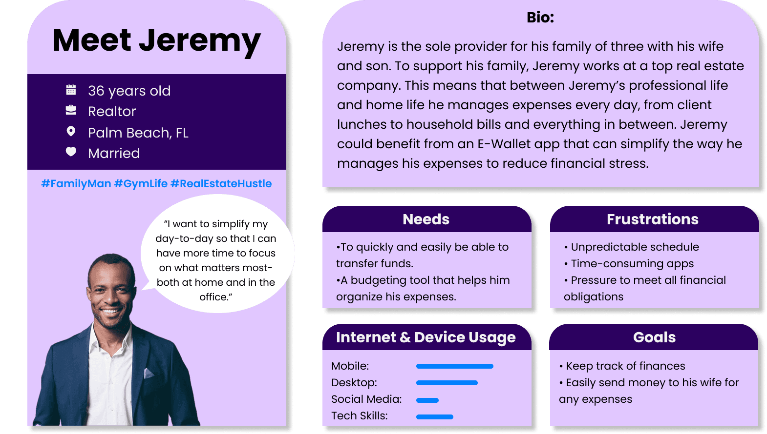
User Personas
User Personas


User Flow Charts
User Flow Charts
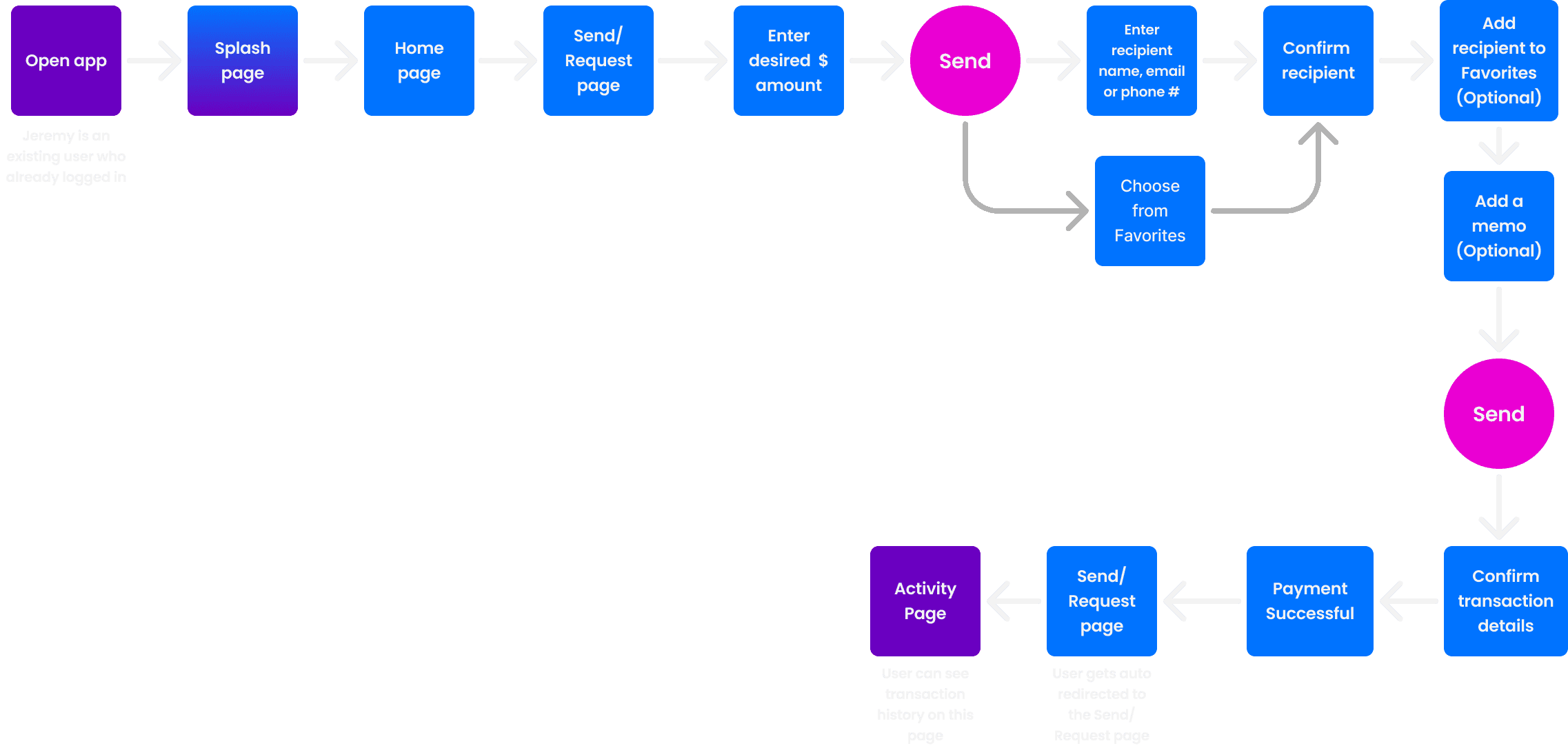
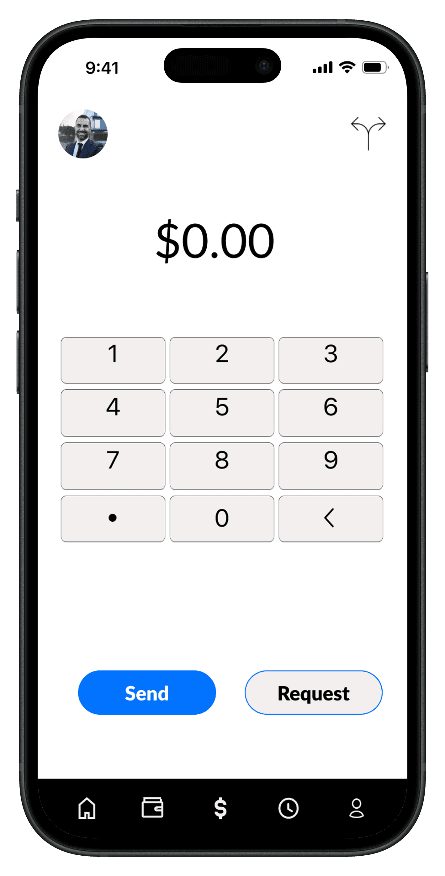
Send money User Flow
Send money User Flow
Send money User Flow
Information Gathering:
What prompted him? Jeremy is affected by his financial responsibility virtually everyday and is looking to simplify the financial management process.
How will he know the task is done? When he can successfully send money to his family members.
What does he already know? He knows he wants quick, effective and secure solutions to keep his financial life organized without compromising safety or convenience.
What additional information does he need? Needs to know how to add his wife to his favorites and how to check transaction activity.
Success Criteria: Jeremy is able to send money to his wife and confirm the transaction successfully.
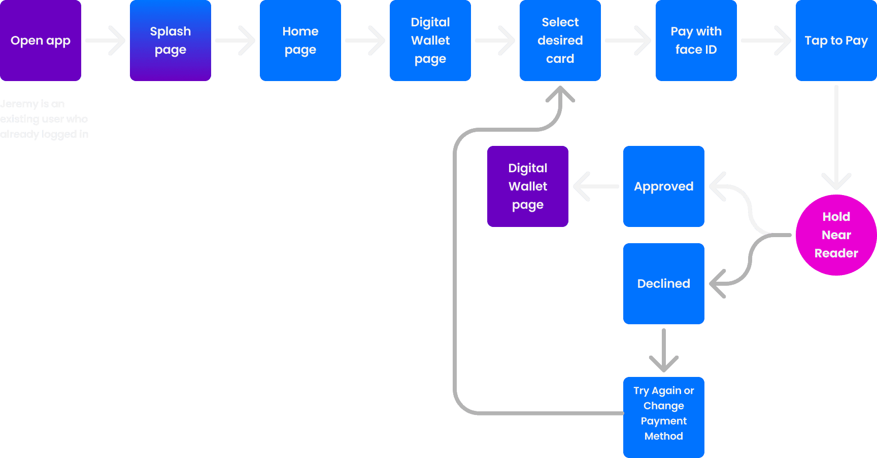
Pay with Digital Wallet User Flow
Pay with Digital Wallet User Flow
Pay with Digital Wallet User Flow
Information Gathering:
What prompted her? With her busy schedule and clumsy habits, she tends to forget her wallet but never her phone. She's looking for a way to pay for things she needs, even when she forgets her wallet at home.
How will she know the task is done? When she can successfully pay for her lunch with her phone.
What does she already know? She knows she wants an effective alternative to paying for things when she forgets her wallet.
What additional information does he need? Needs to know if the locations accept phone pay beforehand.
Success Criteria: Maria is able to successfully pay for her lunch with a digital version of her debit card on her phone.
Information Gathering:
What prompted her? Maria tends to forget her wallet but never her phone. She's looking for a way to pay for things she needs, even when she forgets her wallet at home.
How will she know the task is done? When she can successfully pay for her lunch with her phone.
What does she already know? She knows she wants an effective alternative to paying for things when she forgets her wallet.
What additional information does he need? Needs to know if the locations accept phone pay beforehand.
Success Criteria: Maria is able to successfully pay for her lunch with a digital version of her debit card on her phone.
User Interviews
User Interviews
Interviews revealed a clear opportunity to reduce the time users spend managing money.
Interviews revealed a clear opportunity to reduce the time users spend managing money.
Interviews revealed a clear opportunity to reduce the time users spend managing money.
After initial research, I concluded that a deep-dive needed to occur to really gather insights on user behaviors, emotions, and thoughts. This led me to conduct my first round of user interviews with three participants at different levels of financial expertise. I’ve asked them the questions below to pinpoint common frictions, trends, frustrations, and methods to money management.
After initial research, I concluded that a deep-dive needed to occur to really gather insights on user behaviors, emotions, and thoughts. This led me to conduct my first round of user interviews with three participants at different levels of financial expertise. I’ve asked them the questions below to pinpoint common frictions, trends, frustrations, and methods to money management.
After initial research, I concluded that a deep-dive needed to occur to really gather insights on user behaviors, emotions, and thoughts. This led me to conduct my first round of user interviews with three participants at different levels of financial expertise. I’ve asked them the questions below to pinpoint common frictions, trends, frustrations, and methods to money management.
Research Questions:
- How do you manage your finances?
- How do you feel about the current tools or resources you use for financial management?
- What challenges do you face when organizing your finances? Why?
- In what ways do you think money management could be improved for you?
- How do you typically handle unexpected expenses?

All participants have an organizational system for money.
All participants have an organizational system for money.
All participants have an organizational system for money.
The Main Insight
The Main Insight
Based on the common trends in my affinity map, it became clear that all the participants had the same approach and experience when managing their finances. All participants needed to sign-in to multiple apps to collect the necessary data to check their financial standing.
Based on the common trends in my affinity map, it became clear that all the participants had the same approach and experience when managing their finances. All participants needed to sign-in to multiple apps to collect the necessary data to check their financial standing.
Based on the common trends in my affinity map, it became clear that all the participants had the same approach and experience when managing their finances. All participants needed to sign-in to multiple apps to collect the necessary data to check their financial standing.
Design
Design
Roadblocks + a new approach to a better solution.
Roadblocks + a new approach to a better solution.
Roadblocks + a new approach to a better solution.
Initially, I spent a week trying to decide which of the following approaches to streamlining financial management was most effective: AI financial chat bot assistance, in-app educational microcontent, or a personalized financial health dashboard. Ultimately, I chose the dashboard because it best supports the goal of consolidating and simplifying how users interact with their money while letting users feel in control.
Initially, I spent a week trying to decide which of the following approaches to streamlining financial management was most effective: AI financial chat bot assistance, in-app educational microcontent, or a personalized financial health dashboard. Ultimately, I chose the dashboard because it best supports the goal of consolidating and simplifying how users interact with their money while letting users feel in control.
Initially, I spent a week trying to decide which of the following approaches to streamlining financial management was most effective: AI financial chat bot assistance, in-app educational microcontent, or a personalized financial health dashboard. Ultimately, I chose the dashboard because it best supports the goal of consolidating and simplifying how users interact with their money while letting users feel in control.
1
1
1
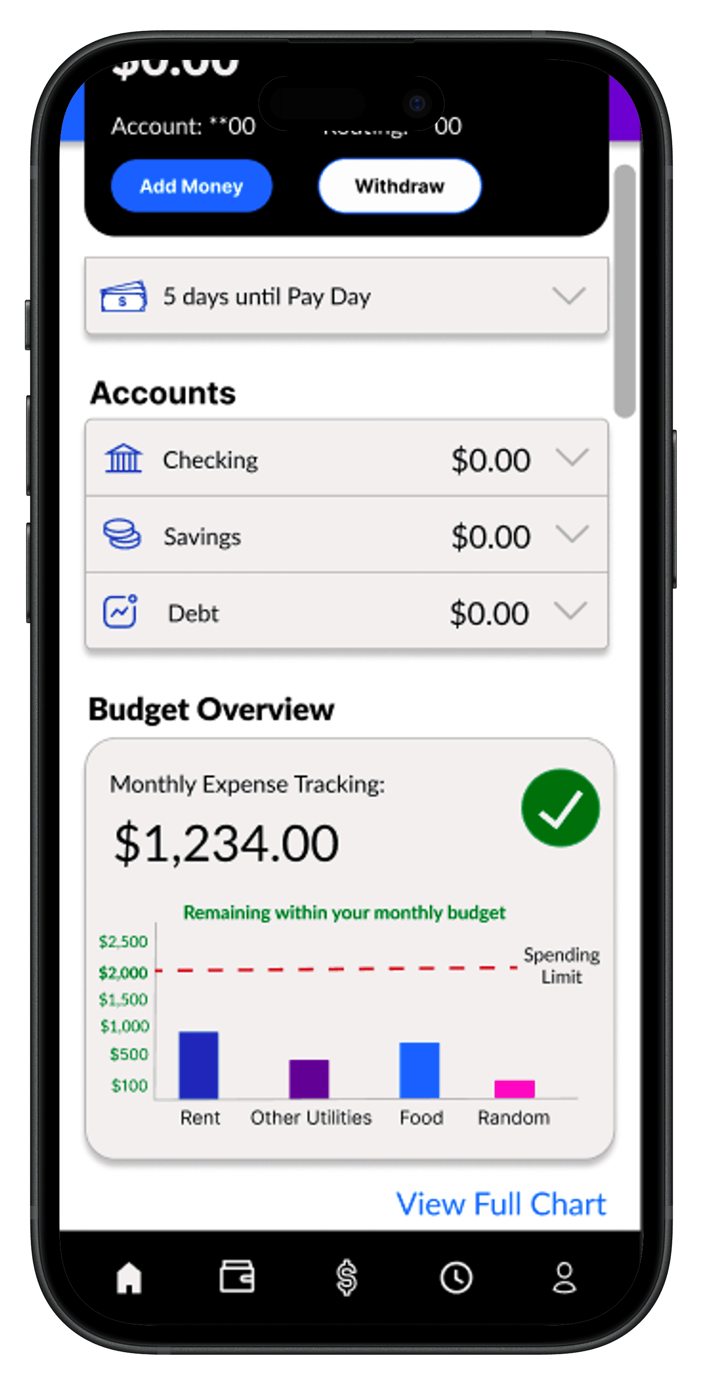
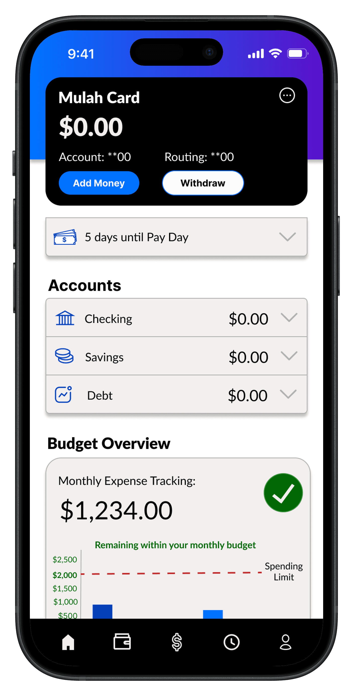
Changing the Budget
Overview graph
Changing the Budget
Overview graph
Changing the Budget Overview graph

Improvements
Improvements
3 major design improvements
3 major design improvements
3 major design improvements
Based on various feedback from my tutor, mentor, peers, and participants I constantly iterated my design over the span of 2 months, with the following major improvements:
Based on various feedback from my tutor, mentor, peers, and participants I constantly iterated my design over the span of 2 months, with the following major improvements:
Based on various feedback from my tutor, mentor, peers, and participants I constantly iterated my design over the span of 2 months, with the following major improvements:
Before
Before
After
After
Before
After
2
2
2
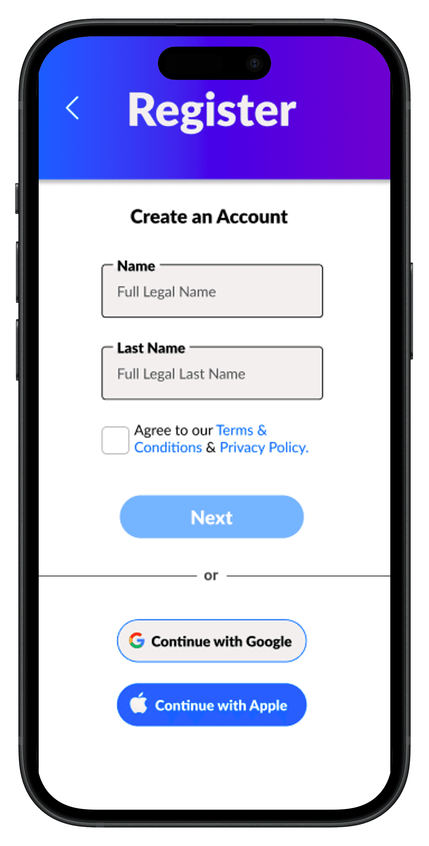
Improved onboarding interface
Improved onboarding interface
Improved onboarding interface
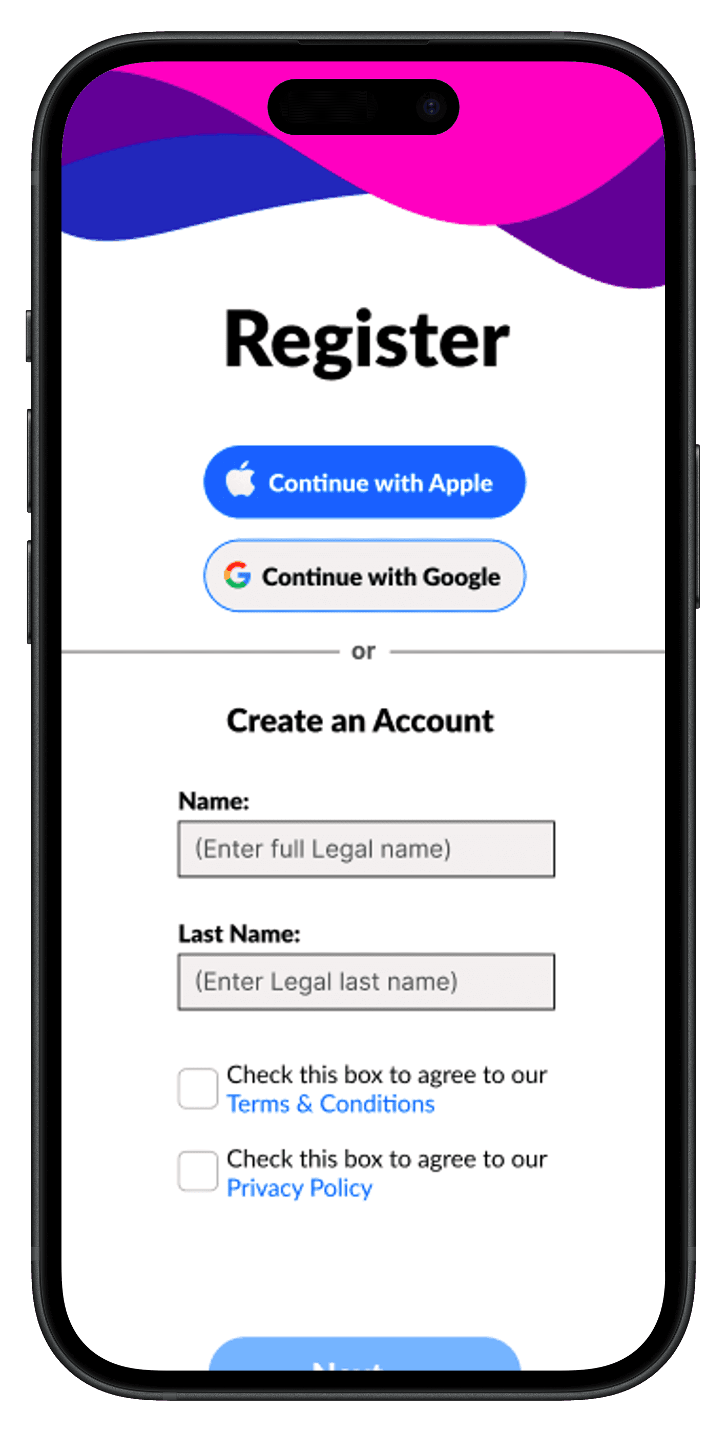
After
3
3
3
Before
After


Switching to a more app-friendly chart
Switching to a more app-friendly chart
User Testing
User Testing
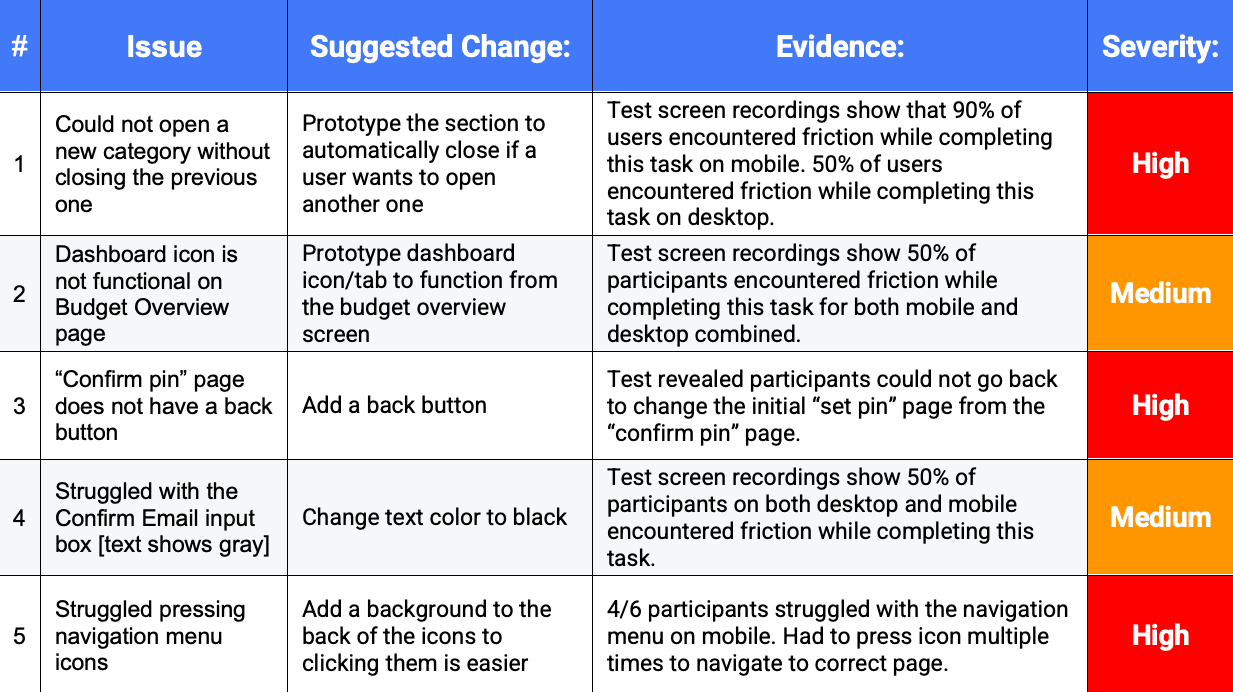
Usability Test Report
Usability Test Report
Usability Test Report
Design with Figma
Design with Figma
Mulah UI Style Guide
Mulah UI Style Guide
Mulah UI Style Guide
A complete component library focused on maintaining visual consistency and streamlining the interface accross Mulah's design system.
A complete component library focused on maintaining visual consistency and streamlining the interface accross Mulah's design system.
A complete component library focused on maintaining visual consistency and streamlining the interface accross Mulah's design system.
Conclusion + Reflection
Conclusion + Reflection
What I'd do differently next time.
What I'd do differently
next time.
What I'd do differently next time.
This was my first full-cycle UX project, where I had the opportunity to explore the complete design process. I genuinely loved the UX design process—from research to prototyping. This experience has made me even more excited to learning and growing in the field. On that note, here are a few things I’ve learned:
- User research is the foundation of a successful design. Though I spent a good amount of time gathering qualitative and quantitative data, I’d dedicate even more time to early-stage research to ensure the design truly reflects a range of user needs and pain points. Looking back, I would invest additional time in conducting broader and more diverse interviews, with sharper interview questions to uncover deeper insights.
- Constant iteration is key. Although I made multiple iterations throughout the entire design thinking process, looking back at the project I would have liked to see more of a growth in UI development, showing significant improvement. Keeping in mind WCAG standards and Nielsens 10 usability heuristic guidelines that I’ve learned, I can now spend less time making sure the app meets design standards, and more time on user-centered design reflection.
- Sketch first, stress later. In the beginning of the iteration process, I found myself overthinking every design choice. Later in the design process I realized these design choices were fine-tuned, which made me realize more time was spent than needed during the early stages of iteration.