Study Together web app
Study Together web app
Study Together is a social-learning platform that helps students connect with peers studying similar subjects. The app supports academic collaboration through content sharing, assignment feedback, and educational videos, while also enabling casual social interaction, fostering a community where students can learn, share, and engage.
Study Together is a social-learning platform that helps students connect with peers studying similar subjects. The app supports academic collaboration through content sharing, assignment feedback, and educational videos, while also enabling casual social interaction, fostering a community where students can learn, share, and engage.
Study Together is a social-learning platform that helps students connect with peers studying similar subjects. The app supports academic collaboration through content sharing, assignment feedback, and educational videos, while also enabling casual social interaction, fostering a community where students can learn, share, and engage.
Services
Visual Design
UI & UX Design
Industries
Education
Social Networking
Date
June 2025 -
October 2025
Services
Visual Design
UI & UX Design
Industries
Education
Social Networking
Date
June 2025 -
October 2025

The Problem
Learning is harder when resources and peer support is limited.
Problem Statement: If students don’t have a reliable way to share knowledge, seek guidance, and stay motivated with their peers, then their learning experience can become fragmented, less engaging, and more challenging to sustain.
This project explores the design of a social learning platform aimed at helping students connect with peers to enhance their academic experience. Many students face challenges staying motivated, finding support, and sharing knowledge effectively. By addressing the challenges of isolation and fragmented learning, the goal is to create an experience that makes academic collaboration more accessible, engaging, and effective for college students.
The Solution
Design a space for students to connect, share feedback, and support each others' learning.
The platform provides students with a central space to connect with peers, share knowledge, and support each other academically and socially. It allows users to post questions, offer guidance, give feedback, and engage in discussions, creating a sense of community and collaboration. By making peer interaction easy and visible, the platform helps students stay motivated, overcome learning challenges, and build stronger academic connections.
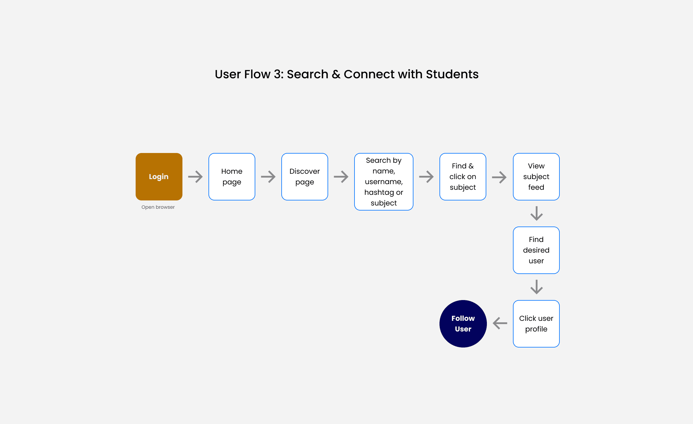
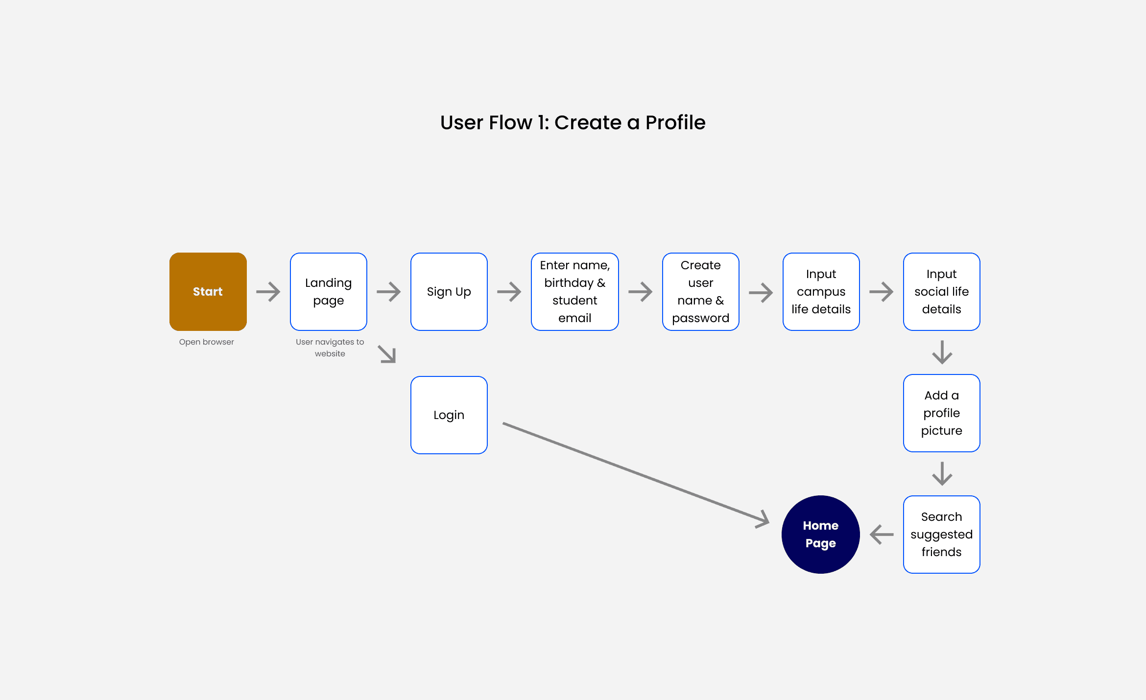
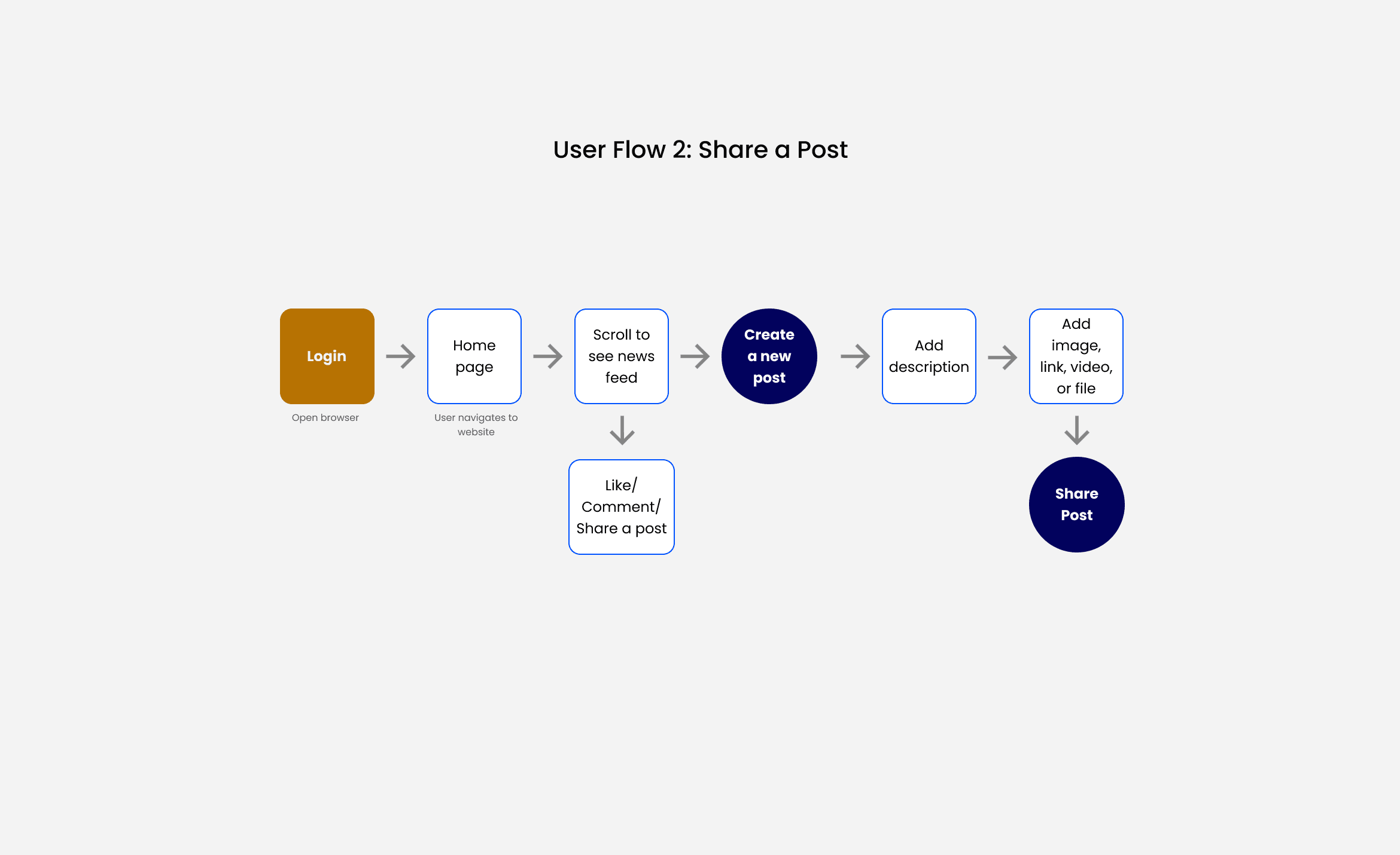
Project Direction
User Stories + User Flows
The platform is designed as a space for students to connect, share resources, ask questions, and provide guidance, fostering an active and supportive learning community. To guide the user flows, I focused on these key user stories from the project brief:
As a new user, I want to create a profile, so other students can find me.
As a new user, I want to find and connect with students in my subject, so we can collaborate.
As a frequent user, I want to view and share content, and write posts, so we can exchange knowledge.
These stories shaped the core flows, ensuring the platform supports collaboration, engagement, and motivation for all users.

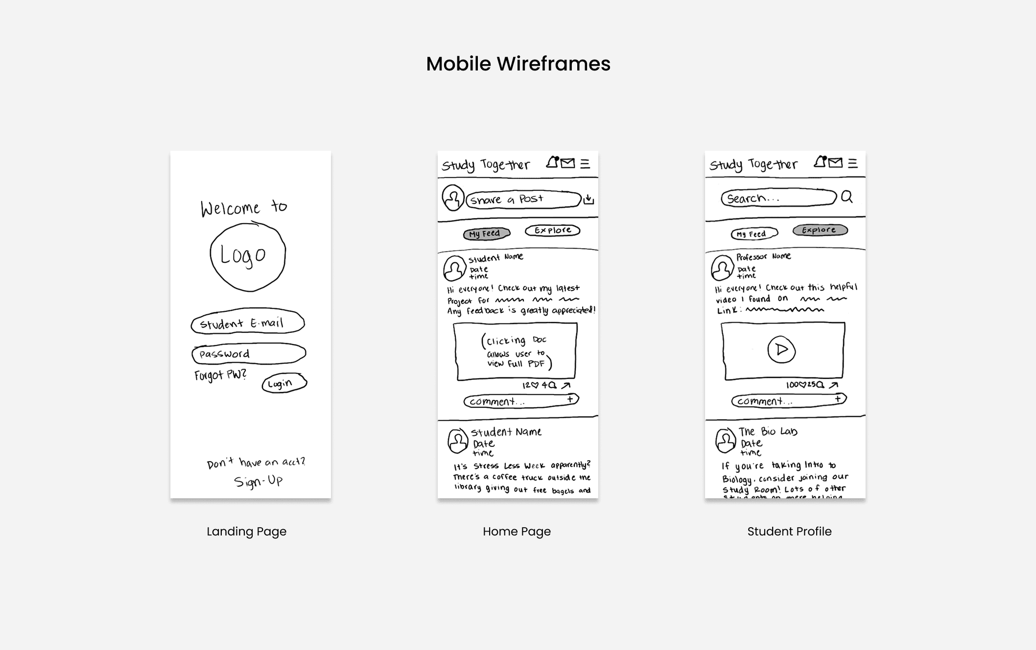
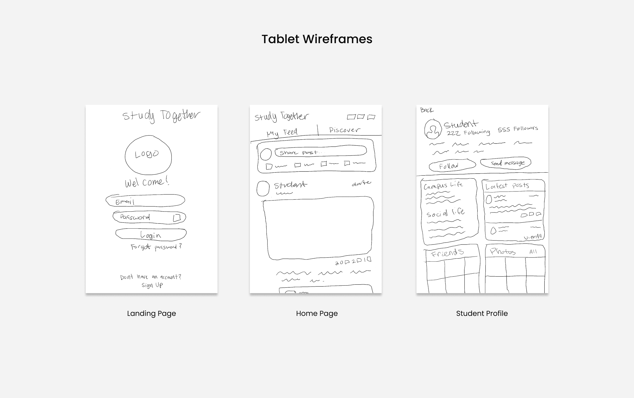
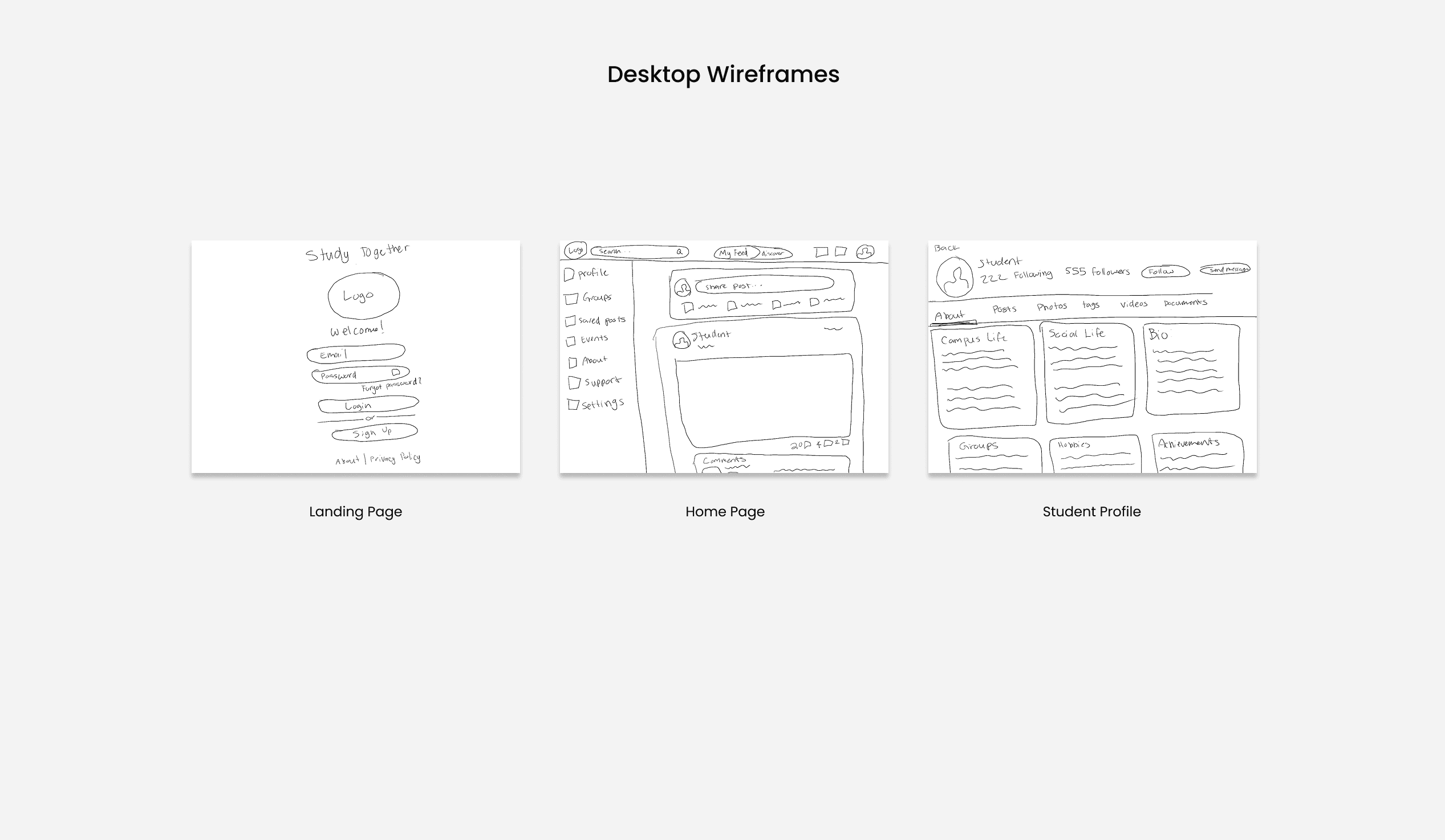
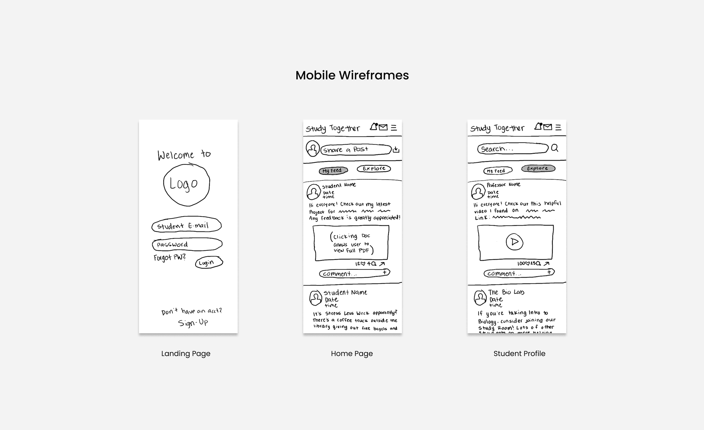
Mobile Grid:
Columns: 6
Margin: 30
Gutter: 15
Tablet Grid:
Columns: 8
Margin: 30
Gutter: 20
Desktop Grid:
Columns: 12
Margin: 40
Gutter: 20
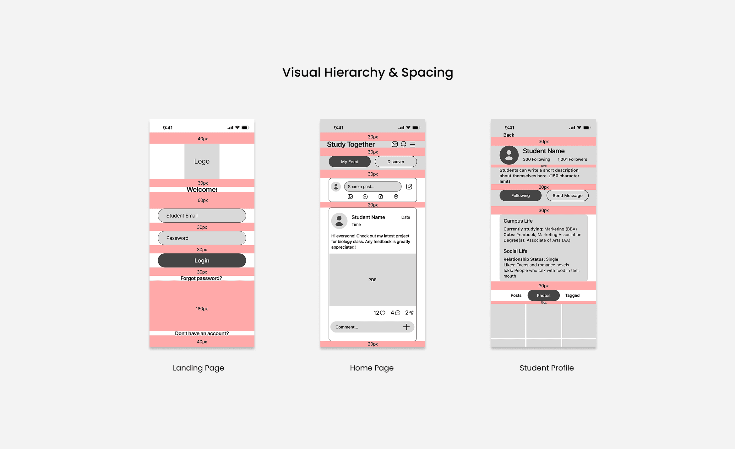
Responsive Layouts
Mid-fidelity wireframes were built using carefully structured responsive grids.
Design Solutions
A guided tour with coach marks was added to reduce user confusion.
Usability testing highlighted confusion in the search flow, prompting the addition of a guided tour to clarify navigation. The tour was also extended to the send message flow to demonstrate how users could react to messages effectively.
React to a message


Search for content


The Final Design
A high-fidelity prototype was developed to demonstrate the product’s visual style and user experience.

Final Test Findings
The final usability test confirmed that users were able to complete all tasks flawlessly.
Incorporating findings from user research and testing, the implemented changes significantly improved usability and intuitiveness. By addressing pain points identified during testing, the design allowed users to navigate the platform with ease, resulting in a more effective and engaging experience.
Preliminary Ideas
Brainstorming low-fidelity wireframes.
After defining the user flows, I began exploring low-fidelity wireframes to visualize the platform’s structure and key interactions. The goal was to quickly map out how users could navigate the platform, connect with peers, share content, and engage in discussions. By sketching multiple layouts and iterating rapidly, I was able to test ideas for the placement of core features such as profiles, posts, and resource sharing. This stage helped identify usability challenges early, prioritize essential functions, and establish a clear foundation for the high-fidelity design phase.


Early User Testing
Research revealed the platform is intuitive, with only one task causing minor confusion.
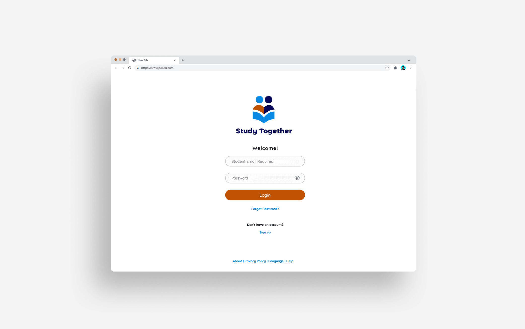
- Sign up for Study Together – creating a new account and setting up a profile.
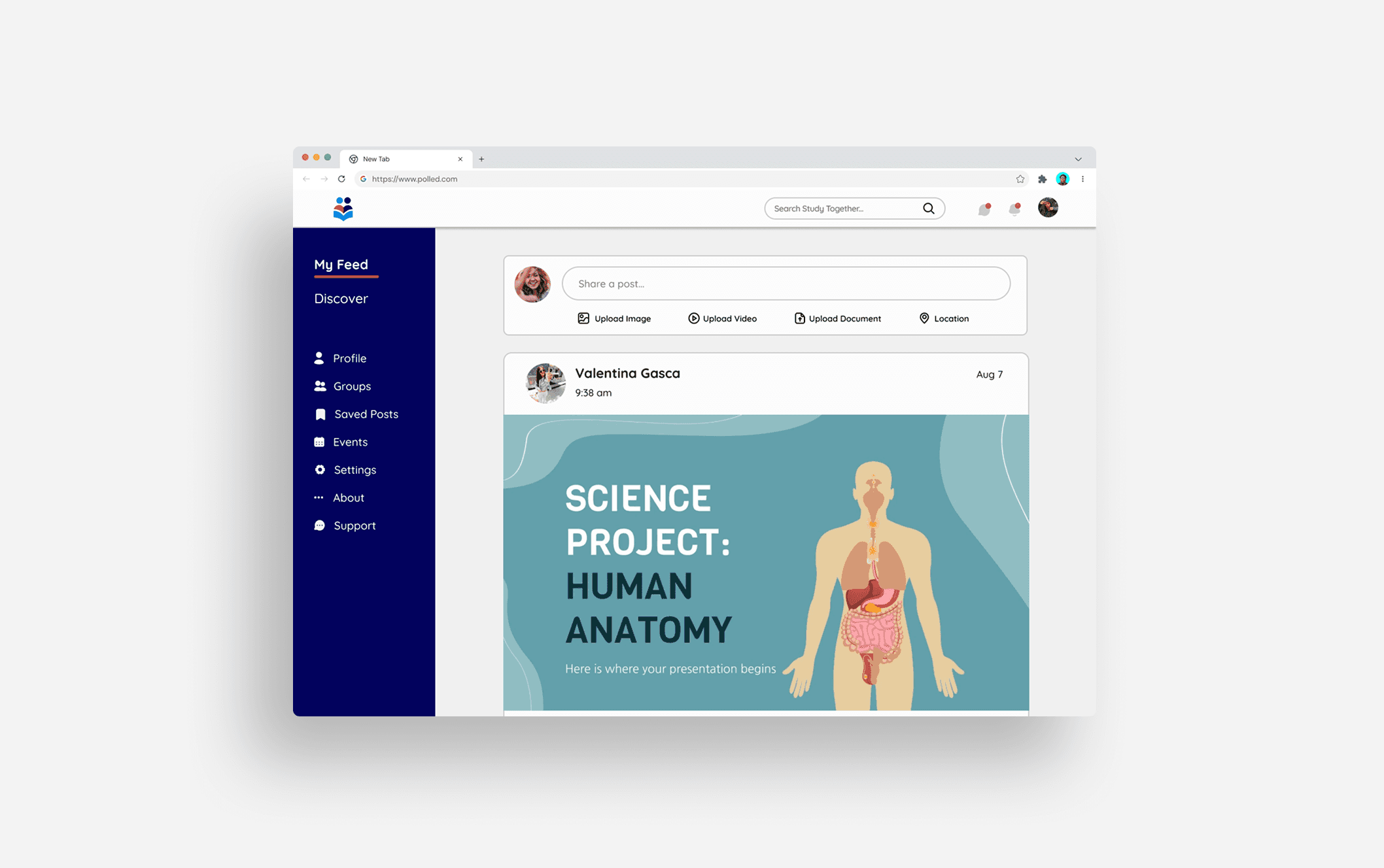
- Share a post – posting content for other students to view and interact with.
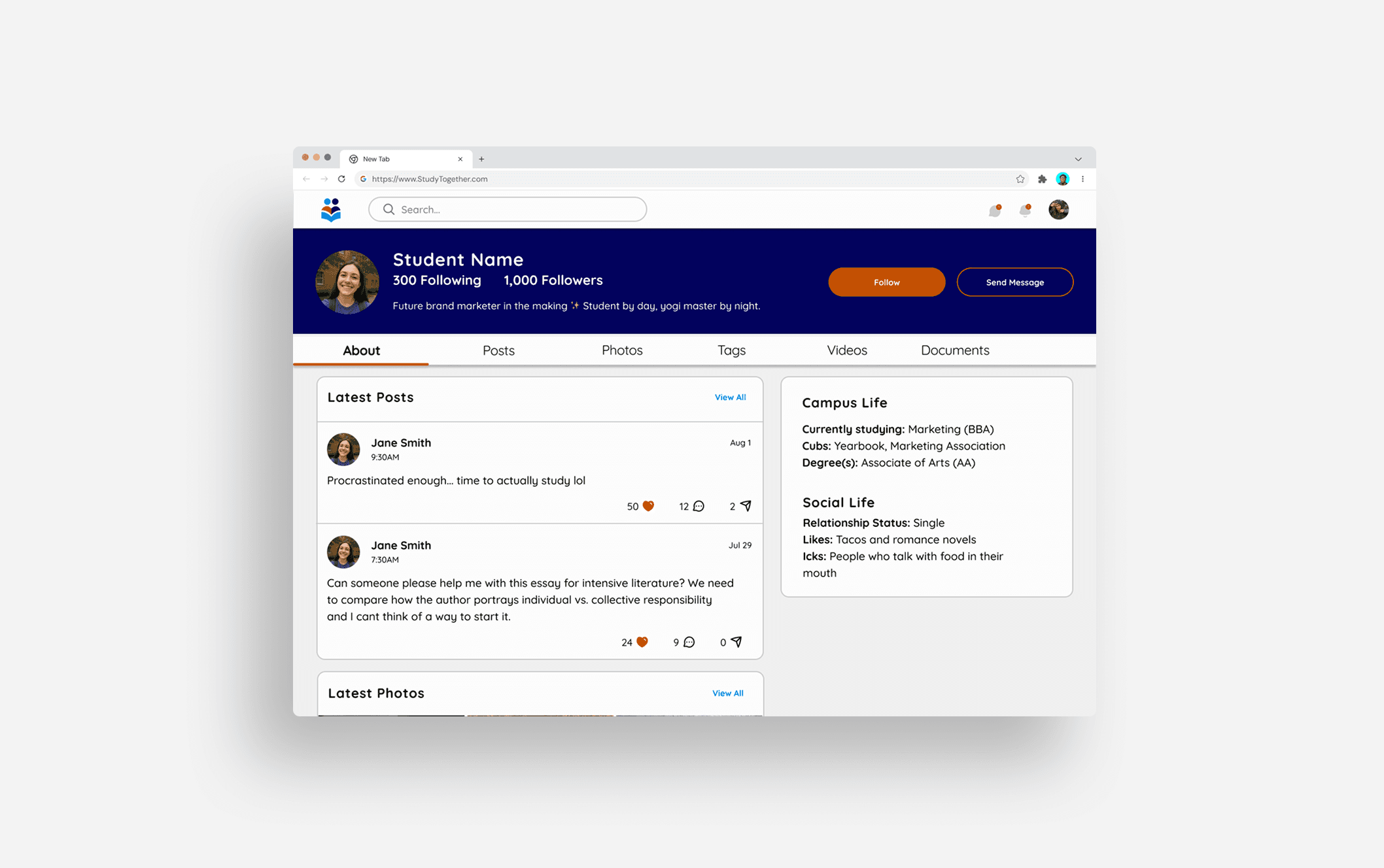
- Search and follow a student – finding classmates and connecting for collaboration.
Preliminary Ideas
Brainstorming low-fidelity wireframes.
After defining the user flows, I began exploring low-fidelity wireframes to visualize the platform’s structure and key interactions. The goal was to quickly map out how users could navigate the platform, connect with peers, share content, and engage in discussions. By sketching multiple layouts and iterating rapidly, I was able to test ideas for the placement of core features such as profiles, posts, and resource sharing. This stage helped identify usability challenges early, prioritize essential functions, and establish a clear foundation for the high-fidelity design phase.
View Low-Fidelity Prototype
Early User Testing
Research revealed the platform is intuitive, with only one task causing minor confusion.
- Sign up for Study Together – creating a new account and setting up a profile.
- Share a post – posting content for other students to view and interact with.
- Search and follow a student – finding classmates and connecting for collaboration.
Responsive Layouts
Mid-fidelity wireframes were built using carefully structured responsive grids.
Responsive Layouts
Mid-fidelity wireframes were built using carefully structured responsive grids.
Mobile Grid:
Columns: 6
Margin: 30
Gutter: 15
Tablet Grid:
Columns: 8
Margin: 30
Gutter: 20
Desktop Grid:
Columns: 12
Margin: 40
Gutter: 20

View Mid-Fidelity Prototype
View Mid-Fidelity Prototype
Design Solutions
A guided tour with coach marks was added to reduce user confusion.
Usability testing highlighted confusion in the search flow, prompting the addition of a guided tour to clarify navigation. The tour was also extended to the send message flow to demonstrate how users could react to messages effectively.
React to a message
Search for content


Search for content
The Final Design
A high-fidelity prototype was developed to demonstrate the product’s visual style and user experience.
The Final Design
A high-fidelity prototype was developed to demonstrate the product’s visual style and user experience.

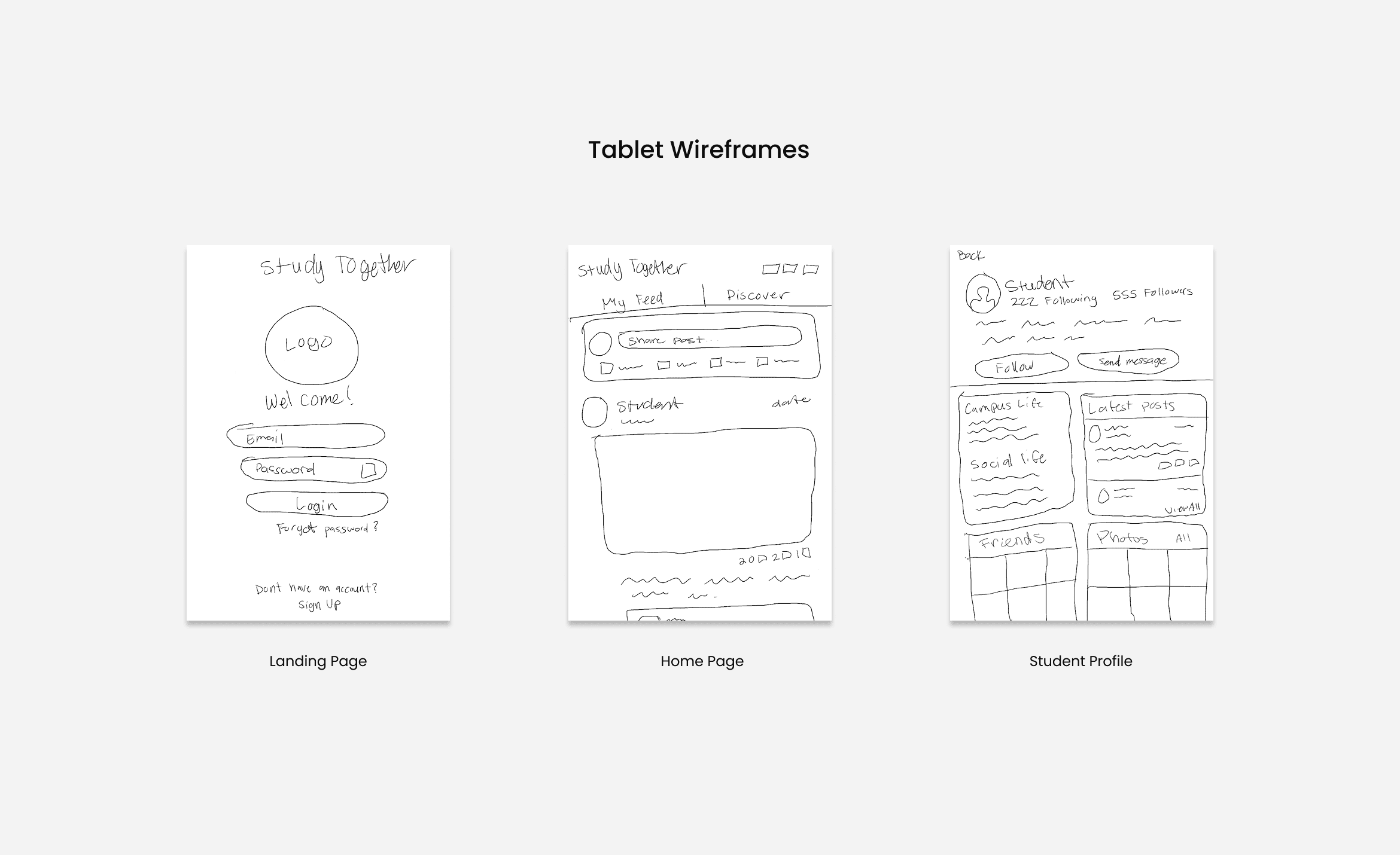
Responsive Designs
The final design for tablet.
The final tablet designs maintain visual consistency with the mobile version while optimizing the layout for a larger display. Key screens including the location page, home screen, and student profile have been adapted to ensure a smooth and intuitive browsing experience. Elements such as spacing, typography, and navigation were refined to enhance readability and usability on medium-sized devices.

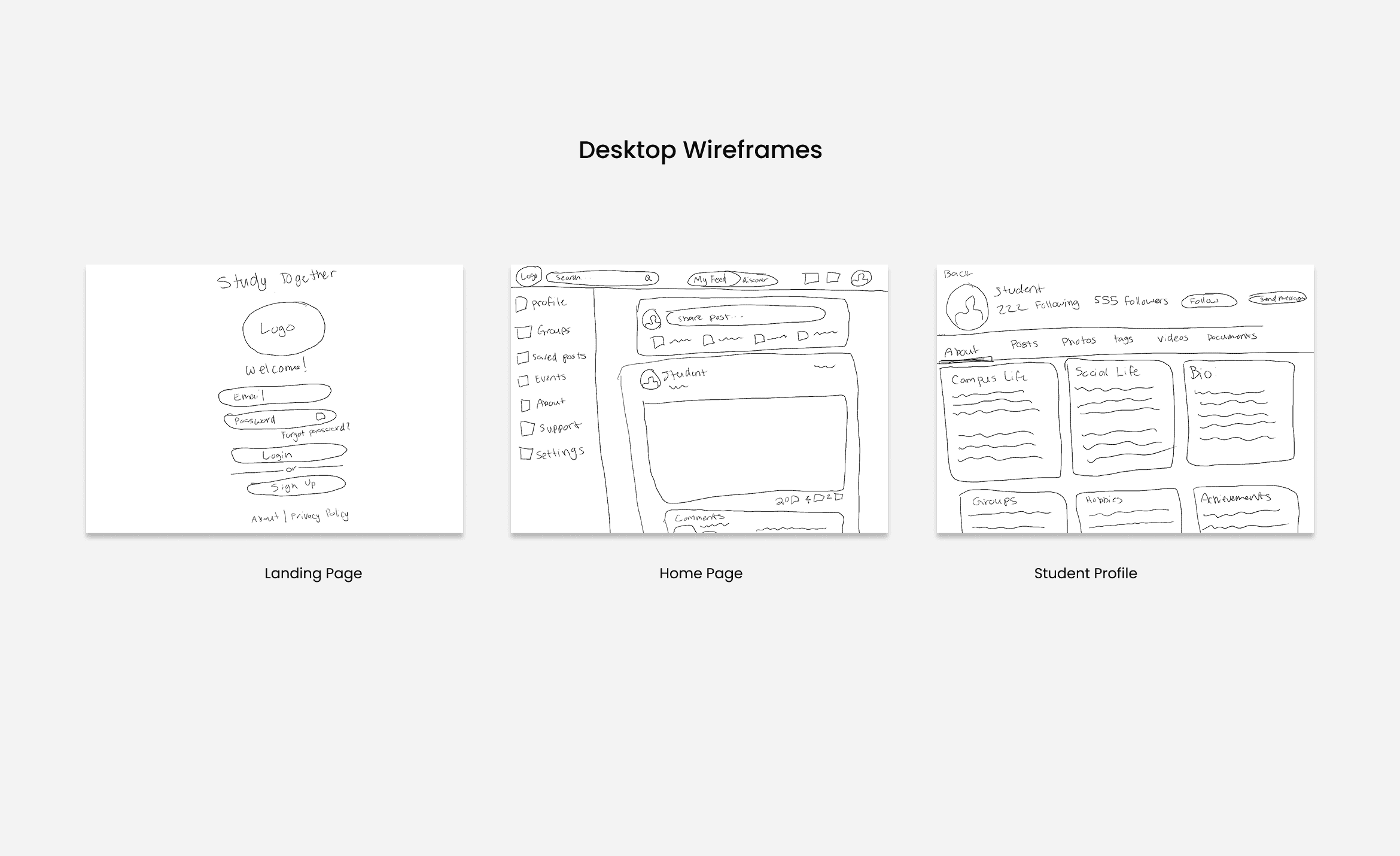
The final design for desktop.
The final desktop designs take advantage of the wider screen space to create a more structured and engaging layout. The landing page, home screen, and student profile were refined to provide a balanced visual hierarchy and improved content visibility. Navigation and interactive elements were adjusted to support efficient browsing, ensuring a seamless experience across all device sizes.
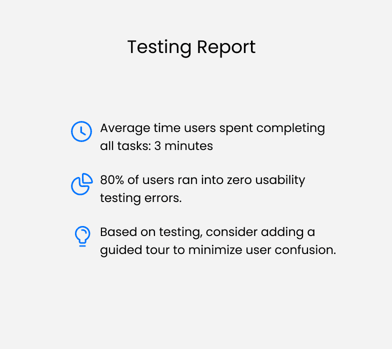
FInal Test Findings
The final usability test confirmed that users were able to complete all tasks flawlessly.
Incorporating findings from user research and testing, the implemented changes significantly improved usability and intuitiveness. By addressing pain points identified during testing, the design allowed users to navigate the platform with ease, resulting in a more effective and engaging experience.


Design with Figma
Study Together Style Guide

Conclusion + Reflection
What I'd do differently next time.
- Leverage design tools and resources more efficiently. I discovered how much time and effort can be saved by using Figma plugins, templates, and other online design resources. Next time, I’d explore and integrate these tools earlier in the process to streamline repetitive tasks and focus more on refining the user experience.
- Prioritize accessibility from the start. While I kept accessibility in mind, I’d like to dive deeper into WCAG guidelines and best practices to ensure the product is inclusive for all users. Incorporating accessibility testing and color contrast checks earlier in the process would make the final design more compliant and user-friendly.
- Organization matters as much as creativity. One of my biggest takeaways was the importance of staying organized across all UX/UI deliverables. I spent extra time revising and resubmitting files for details like alignment and spacing, which taught me that keeping documentation structured and visually consistent is an essential part of the design process.
Design with Figma
Study Together Style Guide
UI documentation
Study Together Style Guide
Learnings and Next Steps
Working on this project was an incredibly rewarding experience! I gained valuable insights, received constructive feedback, and learned a great deal throughout the process, all of which helped me refine my design decisions and sharpen my skills as a UX designer. Building on these learnings, the next steps focus on further enhancing the user experience and refining the platform’s functionality.
Conduct additional usability testing with a larger and more diverse group of users.
Explore new features, such as a tutor feature or class groups, to increase learning and collaboration.
Refine visual and interaction details based on user feedback to improve clarity and delight.
Optimize responsive prototypes across all devices to ensure a seamless experience.
Overall, this project provided significant experiences and insights, strengthening my design skills and reinforcing the importance of user-centered design in creating intuitive, engaging experiences.
What I'd do differently next time.
- Leverage design tools and resources more efficiently. I discovered how much time and effort can be saved by using Figma plugins, templates, and other online design resources. Next time, I’d explore and integrate these tools earlier in the process to streamline repetitive tasks and focus more on refining the user experience.
- Prioritize accessibility from the start. While I kept accessibility in mind, I’d like to dive deeper into WCAG guidelines and best practices to ensure the product is inclusive for all users. Incorporating accessibility testing and color contrast checks earlier in the process would make the final design more compliant and user-friendly.
- Organization matters as much as creativity. One of my biggest takeaways was the importance of staying organized across all UX/UI deliverables. I spent extra time revising and resubmitting files for details like alignment and spacing, which taught me that keeping documentation structured and visually consistent is an essential part of the design process.
Conclusion + Reflection
What I'd do differently next time.
- Leverage design tools and resources more efficiently. I discovered how much time and effort can be saved by using Figma plugins, templates, and other online design resources. Next time, I’d explore and integrate these tools earlier in the process to streamline repetitive tasks and focus more on refining the user experience.
- Prioritize accessibility from the start. While I kept accessibility in mind, I’d like to dive deeper into WCAG guidelines and best practices to ensure the product is inclusive for all users. Incorporating accessibility testing and color contrast checks earlier in the process would make the final design more compliant and user-friendly.
- Organization matters as much as creativity. One of my biggest takeaways was the importance of staying organized across all UX/UI deliverables. I spent extra time revising and resubmitting files for details like alignment and spacing, which taught me that keeping documentation structured and visually consistent is an essential part of the design process.